So, you’re building a site in the hopes of dominating the Yola Buildathon Contest, but where your layout skills peak, your color choices plummet.
Relax your mind, you savvy site-builder, you. In a mere five minutes you’ll have the color scheme of your dreams and be well on your way to publishing.
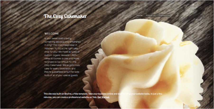
Today, we will be using the The Cozy Cakemaker as an example.

To start, locate an image that’s the main focus of your site – this could be your logo, banner image, or background. The main focus of The Cozy Cakemaker is the mouth-watering cupcake staring at us in the background.
Next, upload your image to Adobe Color CC by clicking the camera button at the top right. Voila! Upon uploading, Adobe Kuler will generate a color palette from your picture.

Check out the drop down menu on the left hand side called “Color Mood,” and click through the choices for a variety of color schemes to set the proper tone of your site.
Want to add in a touch of your own creativity? Drag the color pickers to any part of the image to change the color scheme.

Find your site’s perfect color scheme? Perfect! Click the color wheel in the top right corner and jot down the six-digit hex color codes that form below your selections. Hop back into your Sitebuilder and add these codes to the color section of Style Designer.
Now, take a second to sit back and admire the brilliant site you’ve just pieced together. Go ahead and publish your site and submit it to the Yola Buildathon Contest. The contest ends on February 9th, what are you waiting for?
Looking for more 5-minute website fixes? Learn how to wow your visitors with a picture gallery, and check back for more quick design tips!