After combing through our blog, absorbing everything from creating online personas to why brand identity and logos are helpful for your business you’ve retained all of the knowledge necessary to be a site building buff. The only thing standing between you and a traffic driving, profit building, top performing website is, well, a website itself.
So you know all of the key pointers to produce your picture-perfect site, but are craving inspiration to get the creative brain synapses sparking? You’ve come to the right place. We’ve got the scoop on three fantastic websites to give your site building ingenuity the kick-start that it needs.
Airbnb

Airbnb, a company founded in 2008 that has helped place over 8.5 million guests, specializes in making the process of renting vacation accommodations easy for both the renter and the host.
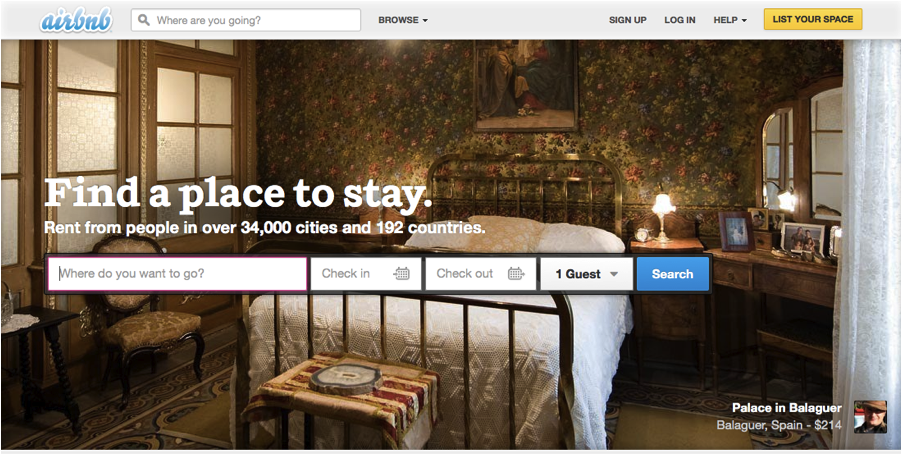
When landing on Airbnb’s homepage, the first thing you’ll notice is their perfectly placed Call-To-Action (CTA) encouraging you to “Find a place to stay.” Their high quality banner image paired with their lingering question (where are you going), demands their viewers’ attention, compelling them to the next step.
In addition to a gripping homepage, Airbnb has a number of helpful pages to get new users on their feet. These pages detail frequently asked questions, step-by-step tutorials and information regarding trust and safety.
Uber

Uber, a company founded in 2009 expanding to over 20 countries, is a car service linking drivers with customers through a smartphone app.
At first glance, similar to Airbnb, what stands out about Uber’s homepage is their CTA in the middle of their banner image simply stating, “Sign up for Uber.” What they’ve done differently is designed nearly their entire homepage in a grayscale, highlighting their CTA in bright blue. Thus, honing their viewers’ focus and driving them to click through to their signup page, which is the next step.
In addition to their CTA’s, each banner image holds a large, uppercase, car-service-focused phrase, such as “Be the Boss – Take a meeting on the way to the meeting.” and “Arrive in Style – Show up ready for the occasion,” which speaks to the viewers immediate or emotional need.
Uber’s navigation menu is optimized for mobile, making it easy to use and straight to the point and displaying pages such as their help center and blog. Uber’s blog is consistently up-to-date with news and interactive events. Uber’s site is the perfect blend of flashy, fun and innovative, making users want need to use their product.
Evernote

Evernote, a company founded in 2008 now carrying eight desktop and smartphone-based apps, specializes in keeping users organized both at home and on the go.
When you’re in the market for an organizational tool, your main goal is to “Remember Everything,” which Evernote cleverly boasts in their tagline. Staying true to the common theme among each fantastic website previously stated, Evernote, too, has a perfectly placed CTA that encourages users to “Sign Up” on the first glance of their homepage. To make the CTA even more enticing, they have surrounded the text box with the words “Get a free account,” motivating users to sign up risk-free.
Perusing through their marketplace, you’ll notice they sell more than tangible products. The company expands their reach by selling things that don’t require shipping such as “Evernote Premium” packages. For customers where shipping is feasible, they sell everything from “Business Socks” to an “Evernote Edition Scanner.”
Evernote clearly knows the risk of losing customers in translation. Their clear-cut navigation at the top of their homepage makes the flow of their site smooth and easy to follow, linking users to their products, marketplace and blogs. It’s easy to see Evernote’s website runs true to their product – their perfect organization from page to page is exactly what users in the market for an organizational app need to be reeled in.
After looking through these sites, you can see that an amazing website is absolutely obtainable. We hope our run-down of each has rallied you to get started on building an amazing website with a clear focus and direction. Now get out there and start building!