Last week we discussed how to use science to choose better fonts. Once you’ve chosen your ideal font, you’ll need to add it on your pages. Pretty simple.
Style Designer and our Styles will provide your fonts with a default setting. But, you can further customize your fonts to include different weights, line heights and spacing.
Font weights
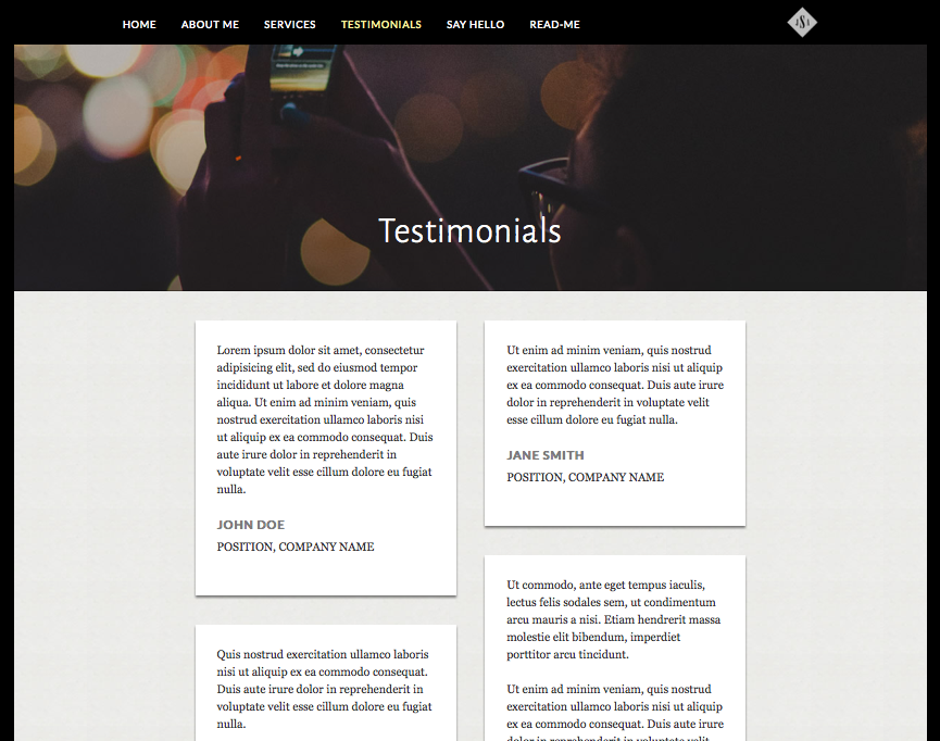
If you want to add style to one of your headers but still stay within the same font, you can leverage different weights. Depending on the font you choose, you will have weight options of light, regular, bold or extra bold. This will help you highlight different text and work great for testimonial pages like the one below:

Letter spacing
Spacing between letters is more important than you might think. If letters are too squished, they’ll be hard to read and similarly if they are too far apart. Here are 5 recommended Google Web Fonts that we have in Sitebuilder that are good for reading longer blocks of content. You’ll be able to adjust letter spacing in Style Designer under Fonts. Choose which header or paragraph text you’d like adjust and use the slider to see which letter spacing is the most appropriate.
Line Height
The height of your lines is also a key factor. This is the space between each line of text. You’ll want to keep enough space so that your letters don’t run into the line below, especially for ‘p,’ ‘g,’ ‘y’ and ‘j.’
Text Transform
Another great element that you can control is text transform. This property allows you to default your fonts to be capitalized, lowercase or uppercase. Depending on your brand and style, you may want to make your fonts have a text transform across each page like in the example below. We recommend using uppercase only for titles as it can be perceived as abrasive for paragraph text.
Have you played around with the font properties in Style Designer? Which are your favorites?
