In our most recent blog post, we compared site building to the five acts of a Shakespearean play. Acts I-III being the build up, Act IV being the climax and Act V, the end result.
In Act V, we will be giving you the finale you’ve been waiting for – a published and searchable website. In the paragraphs to follow, you will learn the key tips to building your own website DIY.
Create a Blueprint
The key to building a great website is organization. A sloppy website gives the appearance of a sloppy business. Instead of uploading photos and widgets at random, create a basic layout of what should go where. Create lists detailing the pages you plan on building and what content will fill them. When it comes time to fill these pages, implementation will be easy, and the flow of your site will reflect positively on your organization.
Build Your Homepage
Once you’ve read up on the essential details on planning your site with SEO in mind and scoped out your competitors, you should have a clear idea of how and what to display on your homepage. When creating your homepage, give your audience enough information to keep them interested and have clear avenues to take them to the next page or pages.
Keep in mind, however, too much information can come across as clutter. The goal is to be clear and to the point: What does your business do/offer and what pain points can it help someone solve?
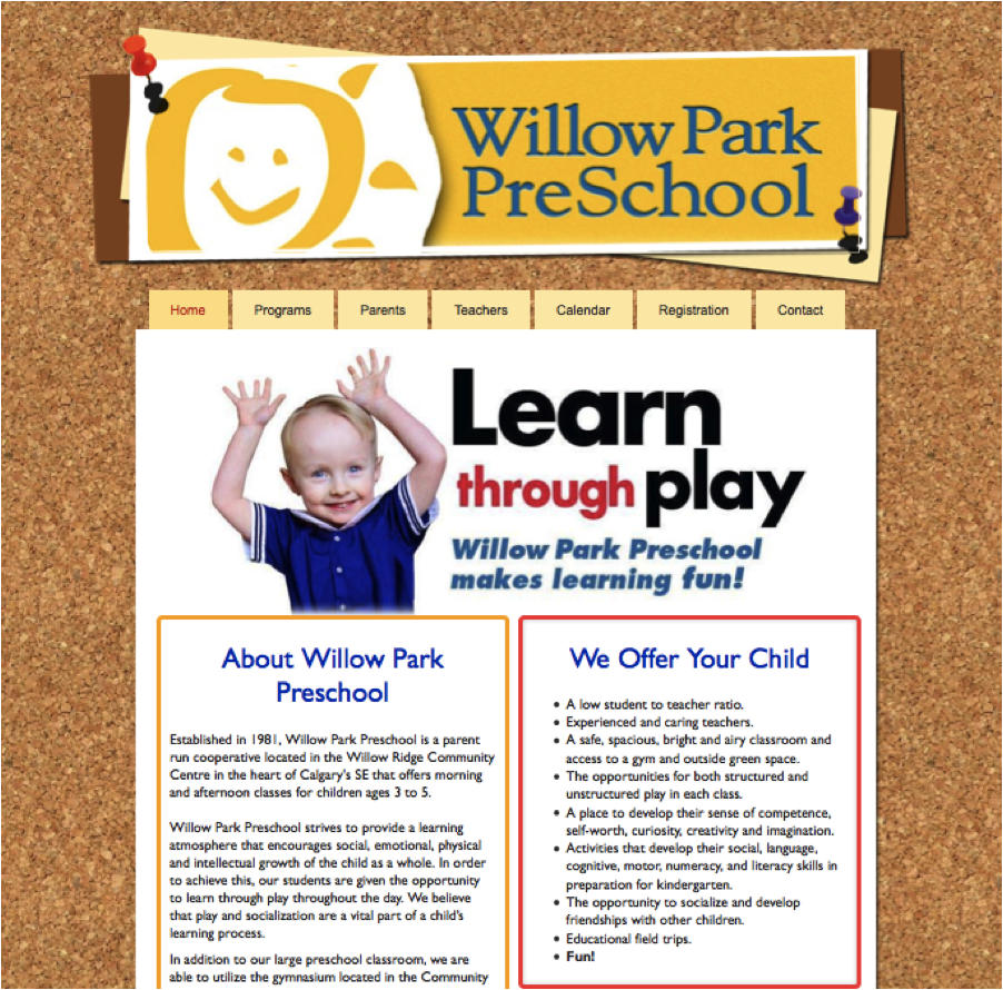
Willow Park Preschool has a fantastic example of an efficient homepage. They have included enough information to make you understand the objective of the business, and what it offers to each audience segment (parent and child).

Create Intuitive Navigation
In creating the blueprint of your site, there is a huge piece of the puzzle you cannot overlook – your navigation. Building a fantastic navigation may not get an outrageous amount of attention, but a bad one will not go unnoticed. When creating your navigation, be sure to use helpful and intuitive terms such as “Home,” “Contact” and “Store.” Clear-cut terms will ensure you’re sending your users exactly where they want to be.
A Compelling Contact Page
Knowing that one of the most important parts of and online business is getting customers to contact you, a successful contact page is absolutely imperative. Being able to reach you should be easy – create contact forms, and eliminate any excuse not to get in touch with you.
The Pear Tree created a personable contact page by forming their comment box as a love letter. In addition, they brilliantly included a form for a mailing list to keep their customers up to date with their latest designs!

With the different tips you’ve learned throughout Acts I-IV, we are confident that creating your own Act V (the execution of your website) will be no problem. We hope these tips have gotten you on the right track. Once you’ve gotten the ball rolling, the rest will come naturally. The hardest part is making the decision to do it.