We would like to introduce you to Sparky, a Happiness Consultant, who is building his website with Yola. Each week we will be looking at different aspects of his website and how he’s using Yola to promote himself.
Today: His homepage, part 1.
Header text and banner:
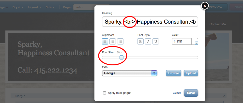
Sparky has used the heading for his name, title and also his phone number. The bold phone number is in the top left-hand side of the website, the most viewed section, so customers know instantly how to get in touch with him. He has used our new ‘Edit Heading’ feature to increase the size of the font and also used <br> tags to put the phone number on another line underneath his name.
Sparky has customized the banner, by uploading his own picture. He used our integrated photo editor, Picnik to re-size and edit the image so it fits the banner perfectly.
Navigation:
The navigation Sparky has used is clear and concise. The page names are not ambiguous and will help his customers find the information they’re looking for quickly and easily.
Content:
You’ll notice that Sparky’s homepage doesn’t have too much copy and the copy it has is easy to read and digest. He has used bold headings to divide the paragraphs up and short sentences that are easy to read. He also hyper-linked the calls-to-action (‘contact me here’ and ‘services I offer’) to make them stand out and help visitors navigate around the site.
The homepage should be used to briefly outline what the site is about and then link through to separate pages which will go into more depth; Sparky’s site is a good example of this.
Next week: Homepage, part 2 – Picture gallery, social integration, creating sections and more…


I can’t see his web address on here.
We’ll be sure to let you know his URL once he publishes the site
How did he make the footer?