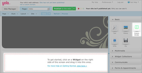
We have been hard at work updating and introducing new widgets to improve your site building experience, and we’re excited to tell you that even more widgets are on the way. We all love “new” but we don’t want you to forget about the widgets that are the everyday stars in helping you to customize your website. We plan to use this new weekly post to inspire you about how to use both new and old widgets to improve the functionality and design of your site.
First up is the Column Divider Widget! This quiet and unassuming widget is a heavy lifter. It can completely change the layout of your website and organize any unruly content. You can nest additional widgets inside the columns created by the Column Divider Widget, and you can even add more Column Dividers inside of Column Dividers to create more columns and organization.
The center divider of the Column Divider Widget can be dragged to the left or right to change the size of the columns. You can also edit the margins by clicking on the “Margin” link on the top left-hand corner of the widget. This will open up a screen that allows you to adjust the margins. You can adjust the margins individually by entering the value desired into each box in the diamond formation (top, right, bottom, left). You can also have your margins be created equally on all sides by dragging the slider to the right to increase the margin size and to the left to decrease it. It is a good idea to create margins so that content from the different columns doesn’t appear to “run together” on the page.

It’s fun doing Widget Wednesday!