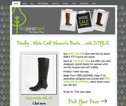
Yola.com’s Featured Site is all for the ladies this week! Fall is in the air, and aside from the leaves changing color and Pumpkin Spice Lattes my favorite part of the season is pulling out my tall boots and cozy sweaters. The Pear Tree offers super sassy boots for those of us that have trouble finding the “perfect pear” because let’s face it, we don’t all have pencil thin calves, but we all like to rock a sleek boot with a kitten heel. The boots reside in Australia, but with free shipping worldwide they will walk, fly or sail to anywhere your feet may be!
Site owner Crystal Robinson shared how she was able to easily build a website, from her struggles to select the perfect style for her website to researching her competitors to make sure she stood apart from the crowd. We thought it was a great study of how to build a successful site and hope that you find it useful as well.
My site has been a labour of love (mostly!) I was put onto Yola after much whining to my IT friends. I’m secretly a control freak and wanted to create and manage my own site with minimal cost. A mentor highly recommended another site builder which would cost thousands of dollars just to use. Why would I pay for something I then had to make myself?
Being a former Graphic Designer I was determined to do it myself, to create my own vision. The hardest part was starting—choosing the style. I ended up changing styles about 6 times. I slowly started to make the style I chose my own, altering colours and logos to soften the feel of my site and making sure it flowed.
I had a few frantic emails to the Yola support team when I couldn’t find, figure out, or upload something, and bless them, they were very patient with me. The support really impressed me, I mean, for a free site builder there’s an awful lot of help available.
I’m on my site adding or editing a few times a week, I love how I can change a price or mistake within 2 minutes and have it live instantly. I’ve had great feedback on the site, my customers love the modern but non-intimidating feel of it. I’ve made sure it’s different to anything else within my niche market to make sure it stands out, yet doesn’t scare people off. I have since recommended Yola to anyone who will listen. Including the person who put me onto it.—Crystal Robinson
Want to see your site featured here? Take a few minutes to tell us what you think makes your site stand out and submit it to: support@yola.com.

Great use of colour in a very subtle but effective clean style. Visually stunning.
Well done.
Lee.
The site has a very nice page lay-out..Very neat and eye catching..
I’m sure more and more customers will patronize the website..
I am very certain that this site was not created using the editor provided by Yola. I have been trying to make my site look organinzed and forget about it! I would love to know the tools used to creat this site.
Hi Michelle,
I can assure you this site was built in the Yola Sitebuilder, as are all the sites we feature in this blog series. Crystal describes her process in the quote in the article. She made use of the Picture Widgets to place all of the images and logos she designed herself in Corel and InDesign and the Column Divider widget helped her organize them. A lot of her site was created using the Text widget. She made it look more customized with her background and banner, but really, as far as our Featured Sites go, this one is more straight forward design wise than a lot of them.
If there is something specific you are struggling to accomplish on your site, let us know, I’m confident we can help you achieve it. Even Crystal needed some help from our support team to meet her design goals! You can mail us at support@yola.com.
Hello Wonderful Site you have some wonderfulgreat helpful tips