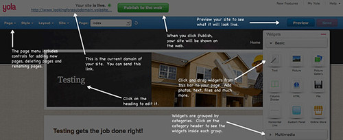
At Yola, we are constantly looking for ways to improve our site building tools. We know that building and editing your website can be a daunting part of getting your business online, and we strive to make our Sitebuilder as intuitive and easy as possible.
As great as we think our Sitebuilder already is, we know we can continue to make it even better. This year we are focusing on three main areas of improvement. First, we want to give you more control over your workspace. When our customers are editing their site, we know the most important thing is the page they’re editing at that moment. We want to help the page stand out and reduce the clutter of controls you don’t currently need. We will be adding a control bar to the bottom of the tool that will let you show and hide the widget sidebar. We will also add in a new style selector that will let you quickly preview your site in a new style without needing to open and close new dialog boxes. Style changes will happen seamlessly from within your page. You will be able to hide tools you don’t need and free up more of the workspace to devote to the most important thing: your site.

The second area we are focusing on will be adding richer web tools into the Sitebuilder. We make it easy to add photos and text to your page, but now we want to provide more tools to support you after you have published your site. This year we added mobile optimized sites and Facebook publishing into the flow. The next step will be to add even more tools that will help your site get found on Google and boost your page ranking. The built-in tools will live within the bottom bar and will provide you real-time feedback about your website. The goal is to make the site building tool a resource for the entire lifetime of your website.

The third user interface area we wish to address is online help. We currently offer email, forum, social, and phone support as well as our help bubbles and guided tour, but we think we can take the concept even further. We are considering adding an easily accessible toggle that will trigger a context sensitive help layer. Click on the layer, and the Sitebuilder will use arrows and text to explain everything on the screen. The idea would be to provide you an easy place to go whenever you have questions about the Sitebuilder. The system would know what you were currently looking at and provide you the help most relevant to the moment.

And this is just the beginning. We have a ton of other features in the works, including styles, widgets and new font choices. It is going to be an exciting year.
– John-Mark, Director of UI & Design, Yola
Evidently, I’m a rare Yola blog reader because your posts receive very few comments. So I don’t think team Yola hears this often enough . . . “thank you”. I greatly appreciate all the things (large and small) that you’re continually improving upon to make my sitebuilding experience easier and more efficient, which allows me to focus on creativity–and your sitebuilder makes that easy, too. Great work, Yola. Keep it coming.
Thanks for your comments Liz! You’re correct that we don’t gather a lot of comments on our blog, rather we nurture more active discussions of our blog content on Facebook and our Get Satisfaction forum, but we appreciate feedback wherever we get it and really appreciate you taking the time to comment here!
Thank you!!!! Thank you thank you!!! Yola is by far the best sitebuilder for years and now, wow, yola is killing the competition once and for all. You know what, yola is the only one sitebuilder that cares about us!!! Thank you!
Pingback: Introducing the New & Improved Sitebuilder | Yola