Before we delve into the pros and cons of using visual or text content, let’s first define what we mean by “visual content.” Visual content can come in many forms, but the most common examples are images, video, slideshows or infographics.
Visual content has become increasingly popular with many startups and high profile brands, allowing them to use strong imagery or videos as a way to instantly show prospect customers what their product is about, negating the lengthy copy.
Studies show visuals are processed 60,000 times faster than text. This means that images are better at grabbing the attention of potential customers, thus making them quicker and more effective than text at communicating key information.
For example, both sites below use images to quickly and efficiently demonstrate how their products are used.


Strong visual content is a great way to make a lasting first impression. It can be extremely emotional and can instantly connect with your customers. In turn, the emotion a customer feels can have a large impact on their decision making, thus explaining why many sites are adopting a visual approach for the design.
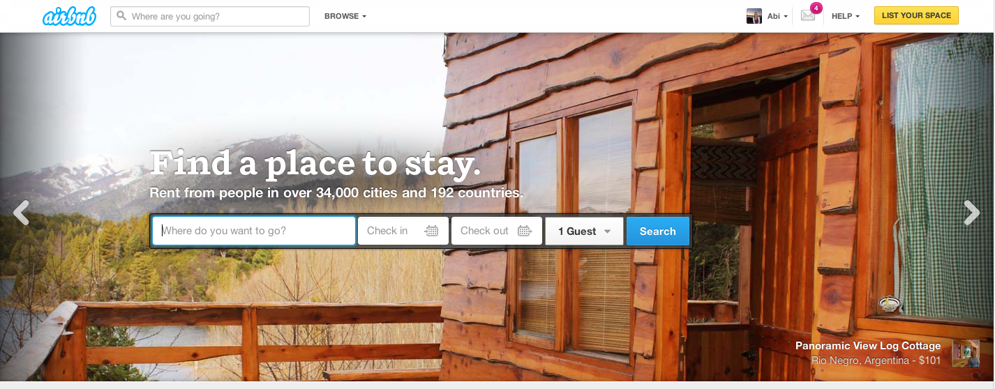
Take the airbnb homepage as an example. The use of beautiful images inspires prospect customers to try the service, playing to their aspirational emotions by using wish-you-were-here imagery.

Visual content works extremely well on website homepages and landing pages where the aim is to hook a customer, making them want to learn more. However, this doesn’t mean that text content on a website is unnecessary. Text content is extremely important for SEO, as it can be easily crawled by search engines with the keywords you are targeting.
From a user perspective, text content gives them more information about the product or service they are interested in once you’ve gained their attention, and the initial introductions are over.
Going back to the Square example above, it is obvious to prospect customers on their first visit that they are able to order a free Square card reader from the homepage. However, Square is probably a relatively new concept to the majority of their first time website visitors. As a result, prospect customers will need more information about the product before they are comfortable enough to sign up. Square caters for those users who require more information, linking from their visual homepage to their pages with more text content, explaining further about their product and service.

As a website owner, you can adopt these types of practices on the website you’ve built.
For example, if you’re building an interior design website to showcase your work, you could use your homepage to display a striking image of a room you have designed. The homepage would feature text content, but it would be relatively minimal and give a general overview of what you do. Your homepage should also include elements to convey credibility to prospect customers. You can then use other pages of your site to explain in more detail about you and the design services you offer.
Interior designer Rebecca Elliott does just that:
Homepage

Services page

On Rebecca’s homepage, she has included a brief sentence explaining what she does, however she has gone into more details on her Services page where she there describes the types of design services she offers.
In order to create a really great website, get the balance of visual content and text content right. Use visual content in the correct places to grab peoples attention and communicate the key points about your business. Then use text content to give your customer the additional information they need in order to make them feel capable of making an informed decision.