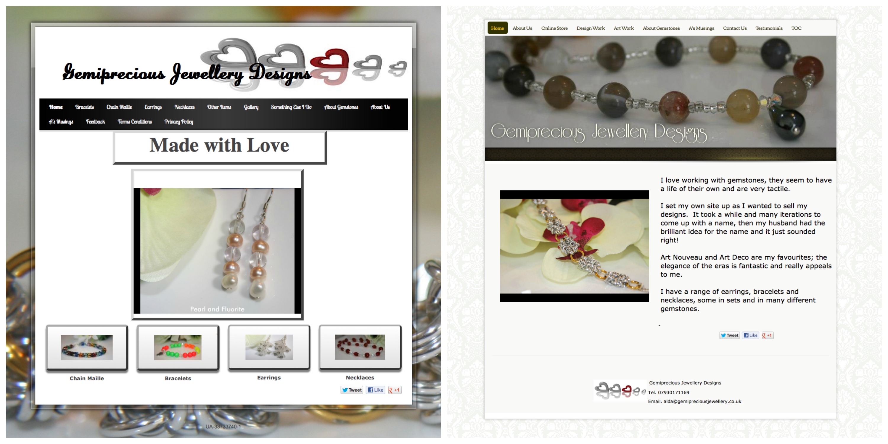
Website owner Alda Mason creates beautiful custom jewelry that she offers for sale on her website, Gemiprecious Jewellery Designs. We wanted to help her incorporate the elegance of her jewelry designs into her website.
It was evident that Alda preferred a clean and “glassy” look based on her original website style choices and her jewelry designs. We wanted to help her maintain that aesthetic while adding in some softness and femininity to appeal to her target audience. We achieved this by changing Alda’s website style to “Classic Line” which softened the look and feel of her website while still maintaining a clean and modern look.
Navigation was another focus as Alda’s original menu was not intuitive and felt very cluttered. We helped her to rename her navigation tabs and reduce them to a single line which made her site more professional and much easier to navigate.
We encouraged Alda to share a little bit about herself and her work on her homepage to draw visitors in, communicate the purpose of the website and begin building trust. Adding a website description on your homepage also helps to improve your SEO.
Alda’s original website utilized her business logo for her custom banner but the hearts did not serve to showcase her jewelry designs. We suggested a banner featuring one of her pieces instead but she was reluctant to move away from her logo as it was already in use on all of her printed business materials. We also incorporated the logo as a part of her website footer to remain cohesive with her printed collateral while still updating her banner to an image that instantly communicated the purpose of the website.
Further to our design suggestions, Alda proved to be an excellent online store merchandiser. She improved the quality of her images as well as the layout of her products. As a result she tells us she has seen an increase in website traffic to her online store and that she is receiving more commissions for custom pieces.
“I have had some really positive comments about the website—how professional it looks now and liking the new colour scheme. I have had an increase of traffic to my store and repeat visitors, so they must like it!” —Alda Mason
If you would like your website to be considered for a design review and possible makeover, please submit your site address here and tell us why you should be selected.
