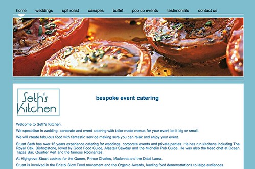
Seth’s Kitchen is whipping up a stellar website with visually appealing, even appetizing, banners that clearly communicate their good taste both in and out of the kitchen!
Site owner Vashti Richards tried out numerous styles before he found his perfect fit.
After trial and error I worked out where I wanted the components to be. After that it was easy. I am really pleased with the site now. Instead of using the banner for a logo I put a different image on each page, as a catering company this worked really well. I then had a play around with the different widgets and added social media buttons, as well as a contact form. Everything was very intuitive, so this was actually easier than I thought. Every time I had a question I typed it in to the help page and there was always an answer to the question.
I have actually had quite a few comments about how good the site is and my friends have been surprised when I say I made it myself in just a few hours. I think the most time consuming thing was not creating the site, but writing the copy and sourcing the right photos. I would definitely recommend it to a friend.—Vashti Richards
We agree that planning for the creation of your website is key. Think carefully about your content prior to creating your website and you’ll be thrilled with the results!
Want to see your site featured here? Take a few minutes to tell us what you think makes your site stand out and submit it to: support@yola.com.

Yola site has been always great online site and web server for me. Through this site I shared my documents and information to my friends and as well as to all the online readers. I am looking forward to experience more web apps made by Yola in future. Thanks for your help and support. Greetings from Bhutan!